Better Charts and Graphs

If you’ve ever trained someone for the IELTS test or had a business English class, there is a good chance that at some point you’ve had to teach the language of describing graphs. There’s also a good chance you taught it only because you really had to, and unfortunately both you and the student found it a bit boring.

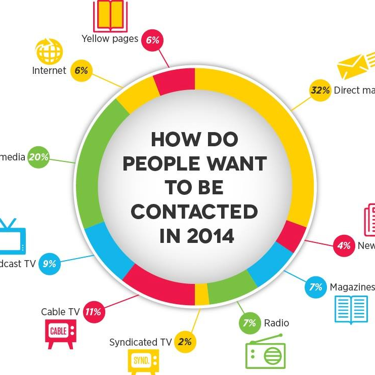
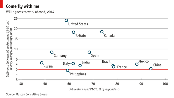
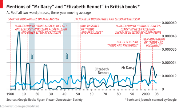
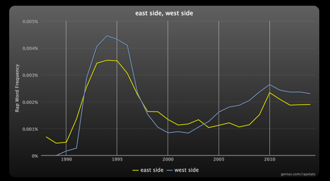
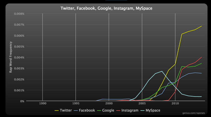
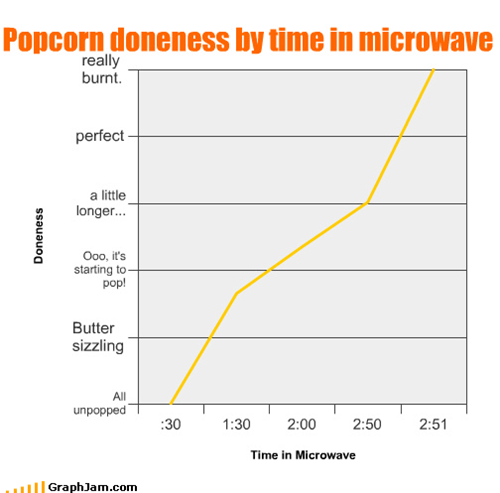
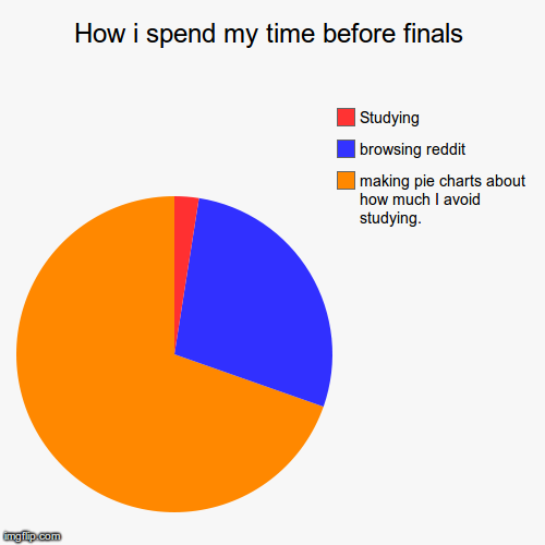
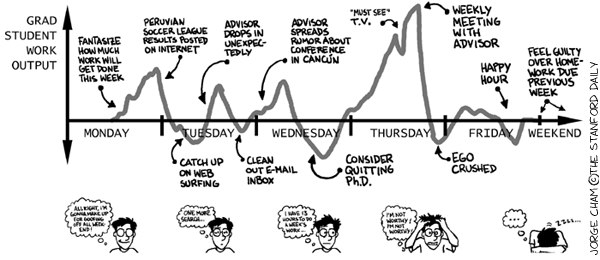
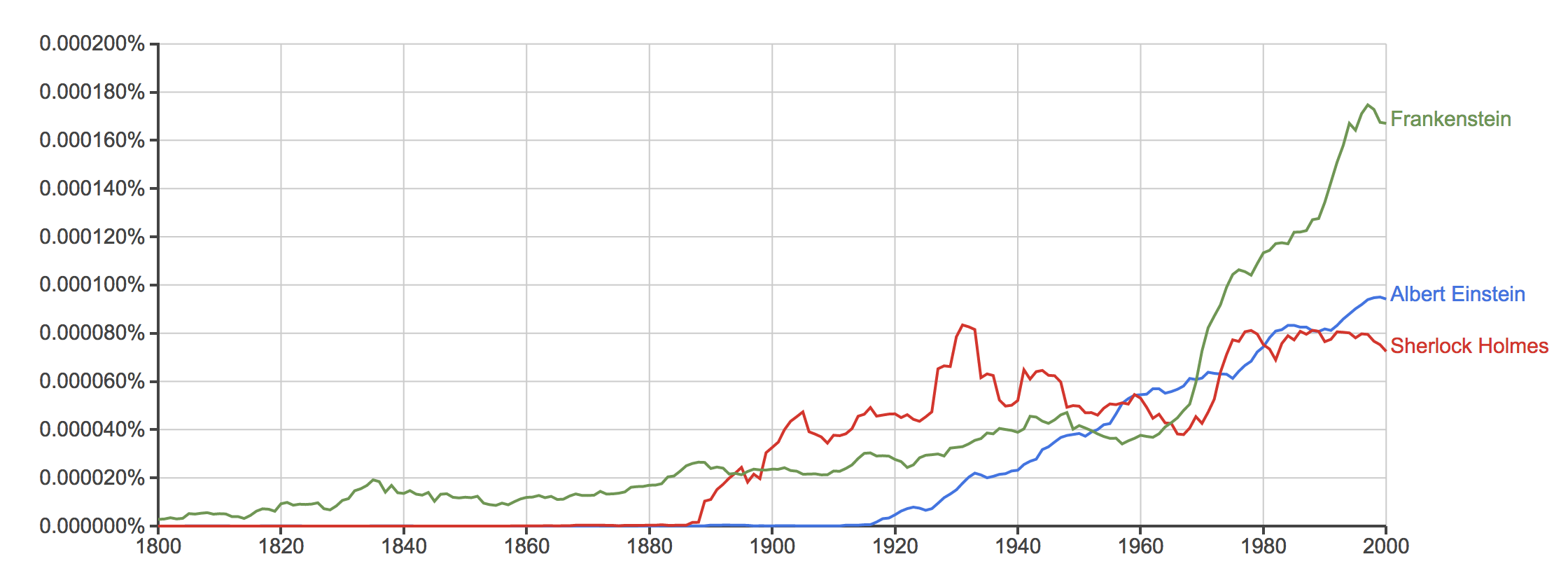
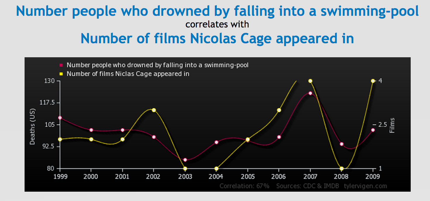
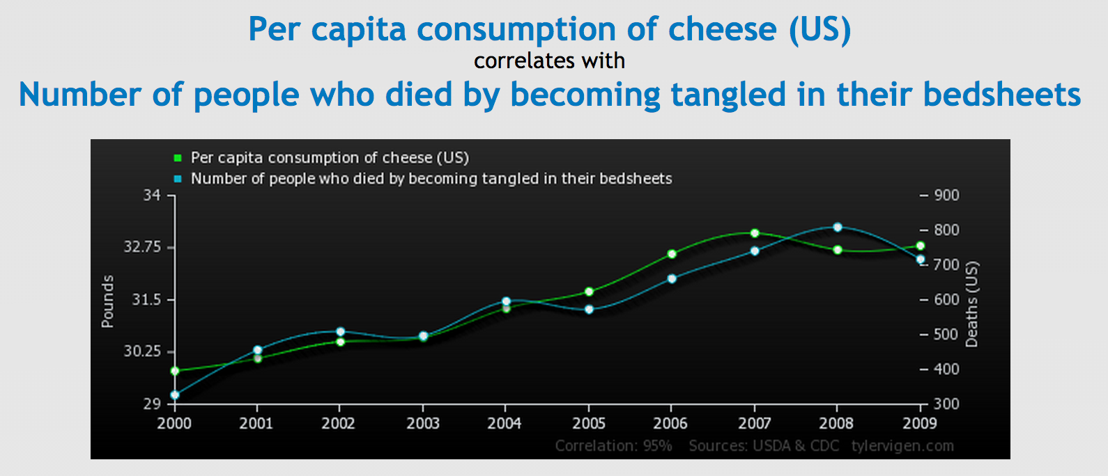
Luckily the Internet is here to help you and now you can find a whole range of interesting and funny graphs to make these lessons more interesting. As you can see from the selection below, you can use graphs which describe classic literature, relationships, morality, migration, and less serious subjects like the distribution of pizza slices and how often various social networks have been mentioned in rap songs since the dawn of the Internet.

As it’s the ability to describe trends that the students need to work on, not the content, you can really use any graphs and charts you want. It should make your classes much more interesting as a result, which is good news for everyone!

The Economist – Facebook

economist2

economist1

Information is Beautiful – Facebook

informationisbeautiful2

informationisbeautiful1

Graphs.net – Facebook

Infographicsbygraphs

The Friday Chart – Facebook

thefridaychart

Last Week Tonight – Facebook

lastweektonight

Genius.com – rap stats

rapgenius1

rapgenius2

Graphjam

graphjamcom

The Bold Italic

thebolditalic

Reddit – Funny Charts

redditprocrastinationpiechart

Truth Facts

truthfacts

Doghouse Diaries

doghousediaries

PhD Comics

phdcomics

Google Ngrams

Screen Shot 2014-10-13 at 17.38.10

Spurious Correlations

Screen Shot 2014-10-30 at 18.30.55

Screen Shot 2014-10-30 at 18.31.29

Do you know any more interesting websites for graphs and charts? Leave a comment below and I’ll add them to the list.

To see some of my ELT graphs, click here.

Advertisement

9 thoughts on “Better Charts and Graphs

  1. Hi James,

    I used to do graph language much more often when I still taught BE – unfortunately, I generally used less inspiring visuals than the ones in your post – but it was part of the syllabus in my EAP class, too. I figured the students would be bored silly if they had to describe the usual business-related charts, so I’d ask them to prepare their own on any topic they chose. (The advantage about asking undergrads to do this, I find – as opposed to business people – is that they rarely complain they have no inspiration.)
    One of the more memorable graphs was the one illustrating the relationship between the length of time a senior colleague at our institution talked (during his own lectures) and the number of students dropping off to sleep. 🙂 The funny thing was, the author of the graph had never seemed very much into the class at all: sat in the back, didn’t contribute much, seemed to be focused mostly on his band…now that I think about it, maybe he was trying to tell me something through the graph as well?

    1. Great idea Vedrana, and I think you’d be more likely to get interesting graphs after using ones like those above! But then there’s always the risk they might do one about you 🙂

Leave a Reply

Fill in your details below or click an icon to log in:

WordPress.com Logo

You are commenting using your WordPress.com account. Log Out /  Change )

Facebook photo

You are commenting using your Facebook account. Log Out /  Change )

Connecting to %s

This site uses Akismet to reduce spam. Learn how your comment data is processed.